Project Overview
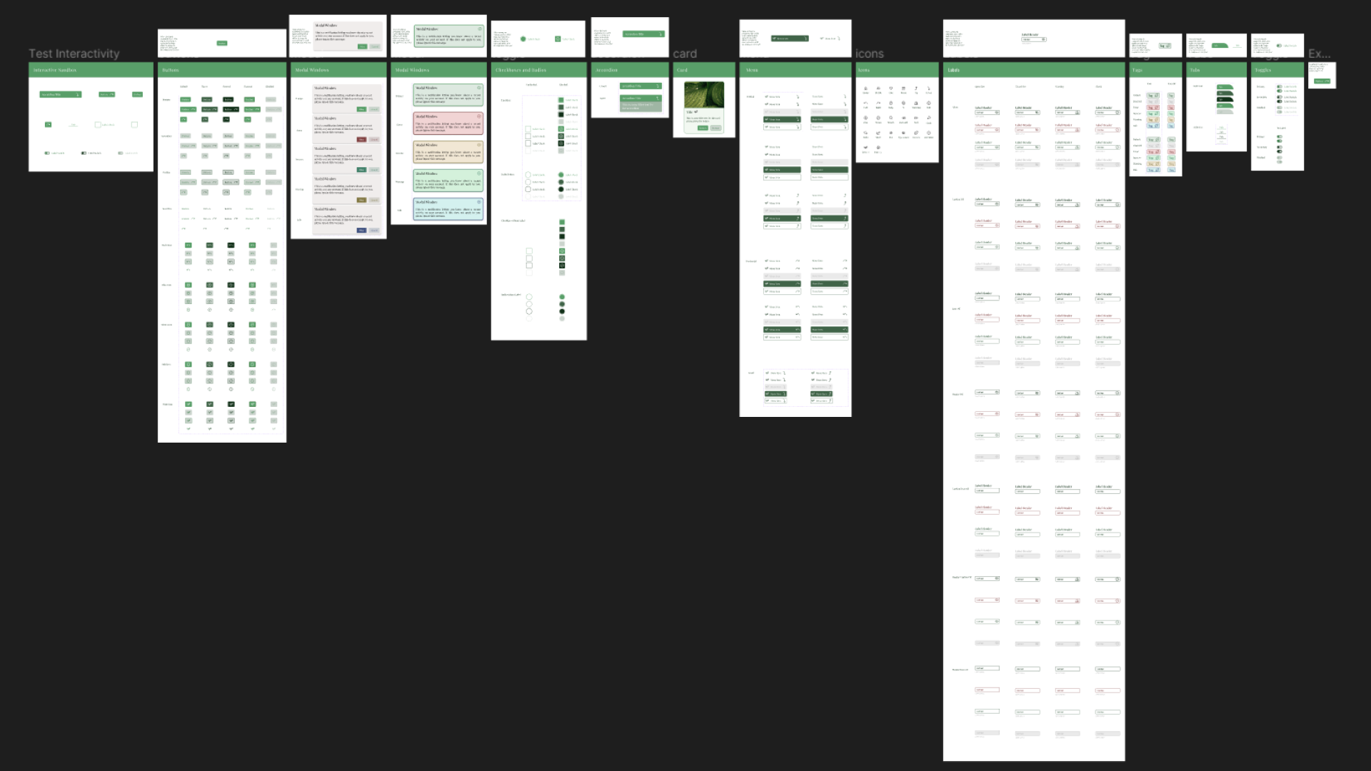
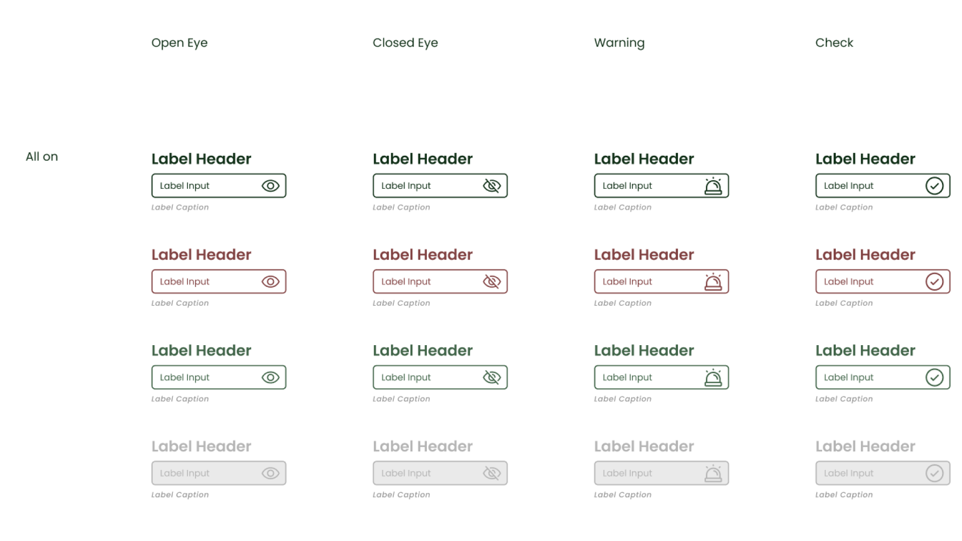
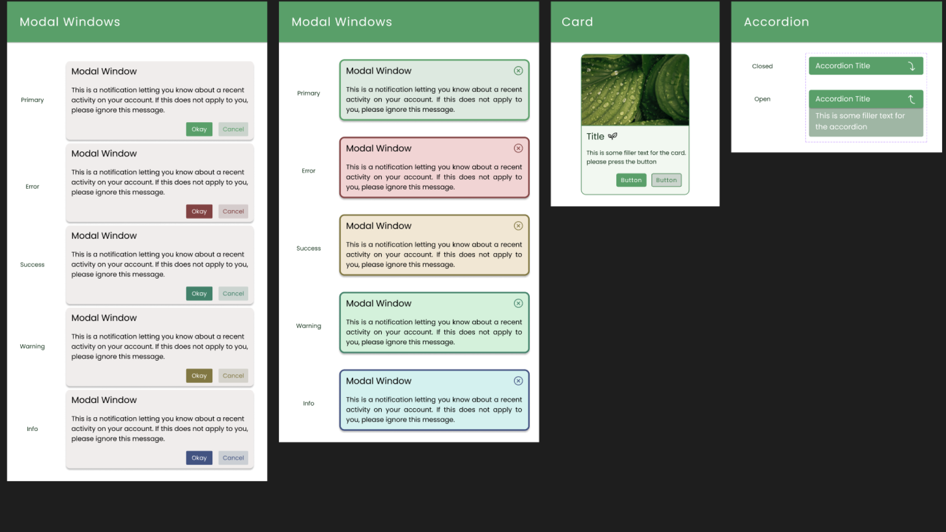
Developing a fully designed and prototyped UI kit for projects is crucial for ensuring consistency and efficiency in design workflows. A comprehensive UI kit allows designers to establish a cohesive visual language and reusable components that streamline the design process across multiple projects. Typically, this kit includes a variety of UI elements such as buttons, modal windows, cards, links, and tabs, all designed to maintain consistency and enhance the user experience.
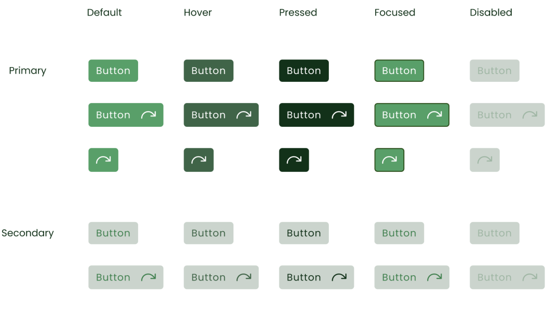
Starting with wireframing, it was crucial to create wireframes as a reference point while finalizing the design. Establishing a cohesive colour palette was essential to unify all elements into a single kit. Each element required five states: Default, Hover, Pressed, Active, and Disabled. Prototyping all elements allowed for easier changes and adjustments as needed. By visualizing how different UI elements interacted with each other through prototypes, we could swiftly test various design ideas.
Incorporating these elements into future projects offers several benefits: consistency, efficiency, streamlined collaboration with others, scalability for different sizes, and an overall improved user experience. In later projects, having these elements on hand has boosted efficiency and creativity, enabling smoother workflows and allowing for more innovative designs.


